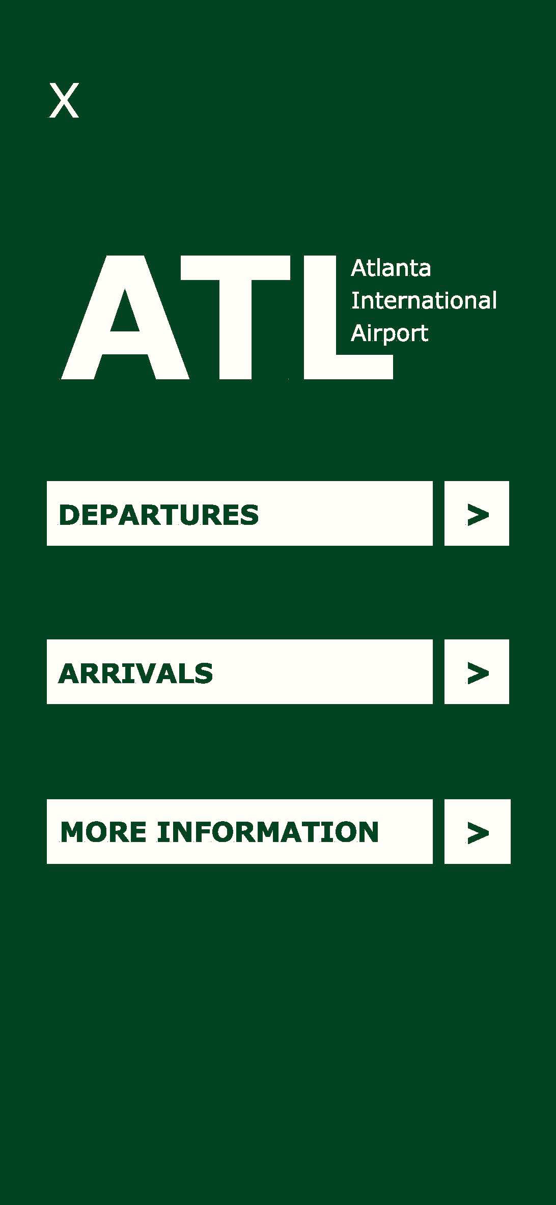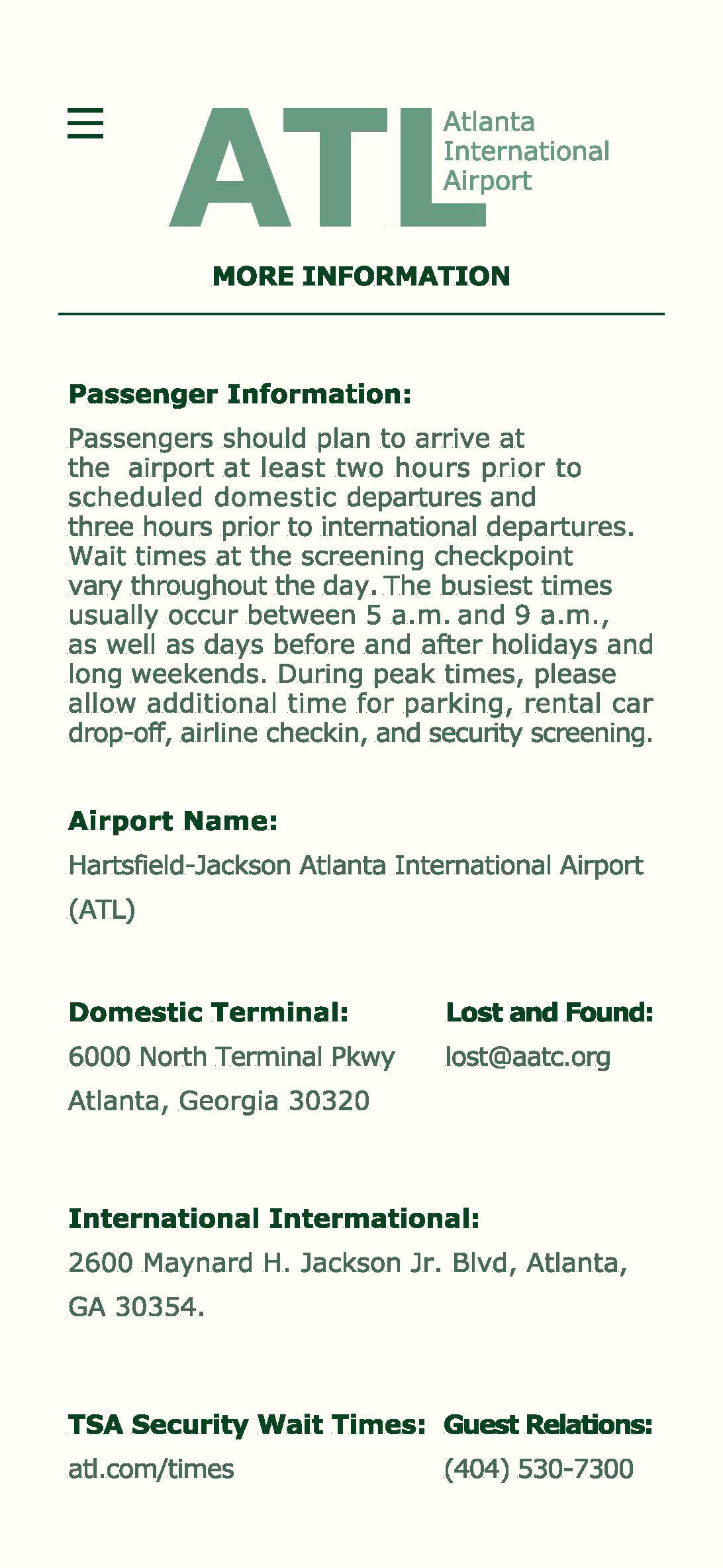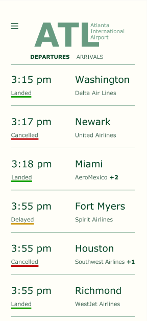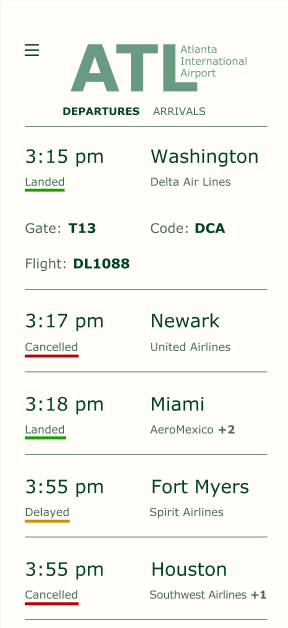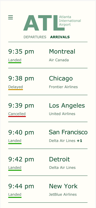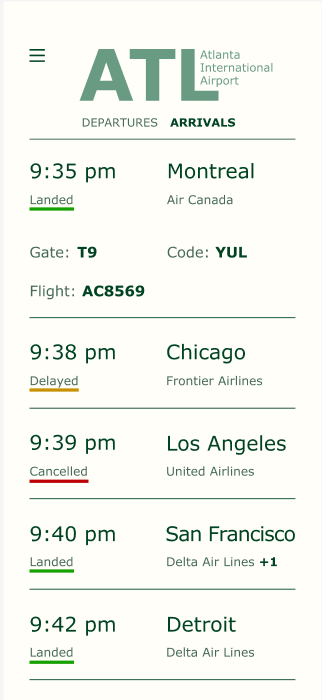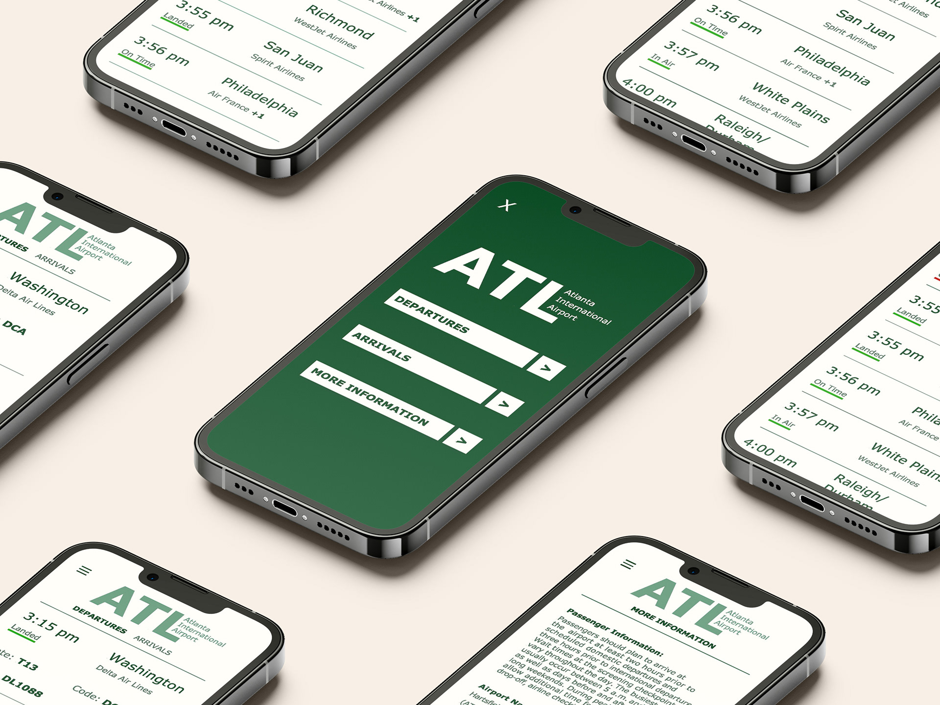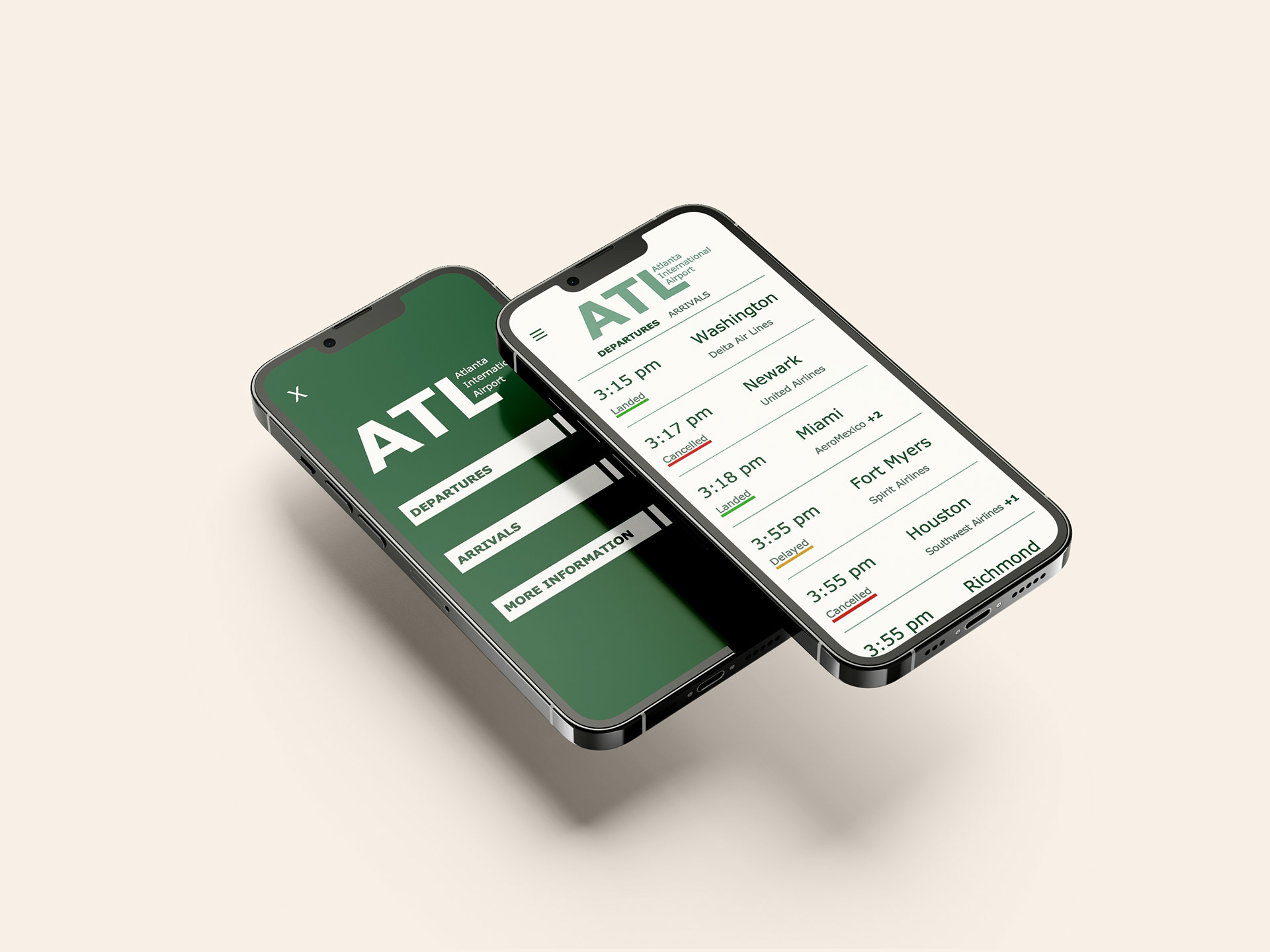
The goal of this project was to apply the typographic skills and grids we learned to a real world application. The application chosen was an airport app for Atlanta International Airport. The intent was to make an app that is accessible for a wide range of people and is easy to navigate.
Phase 1: Research
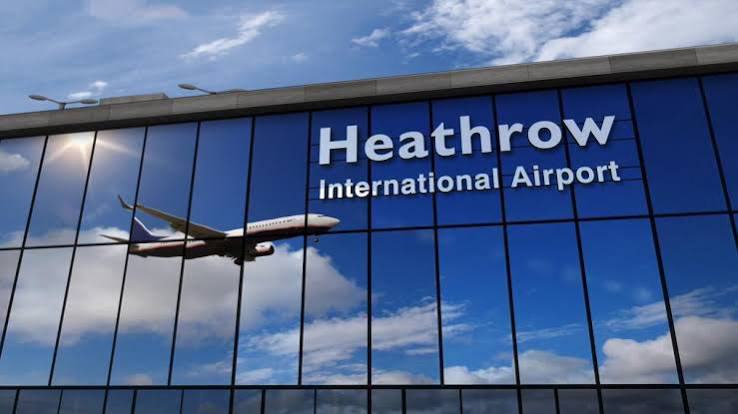
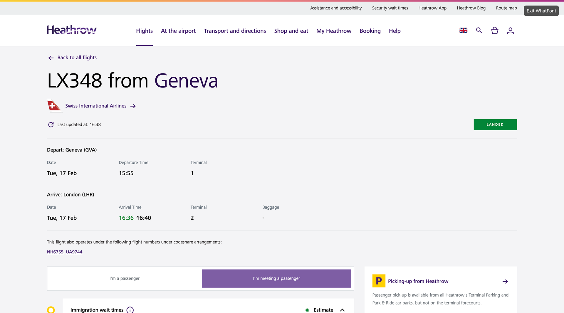
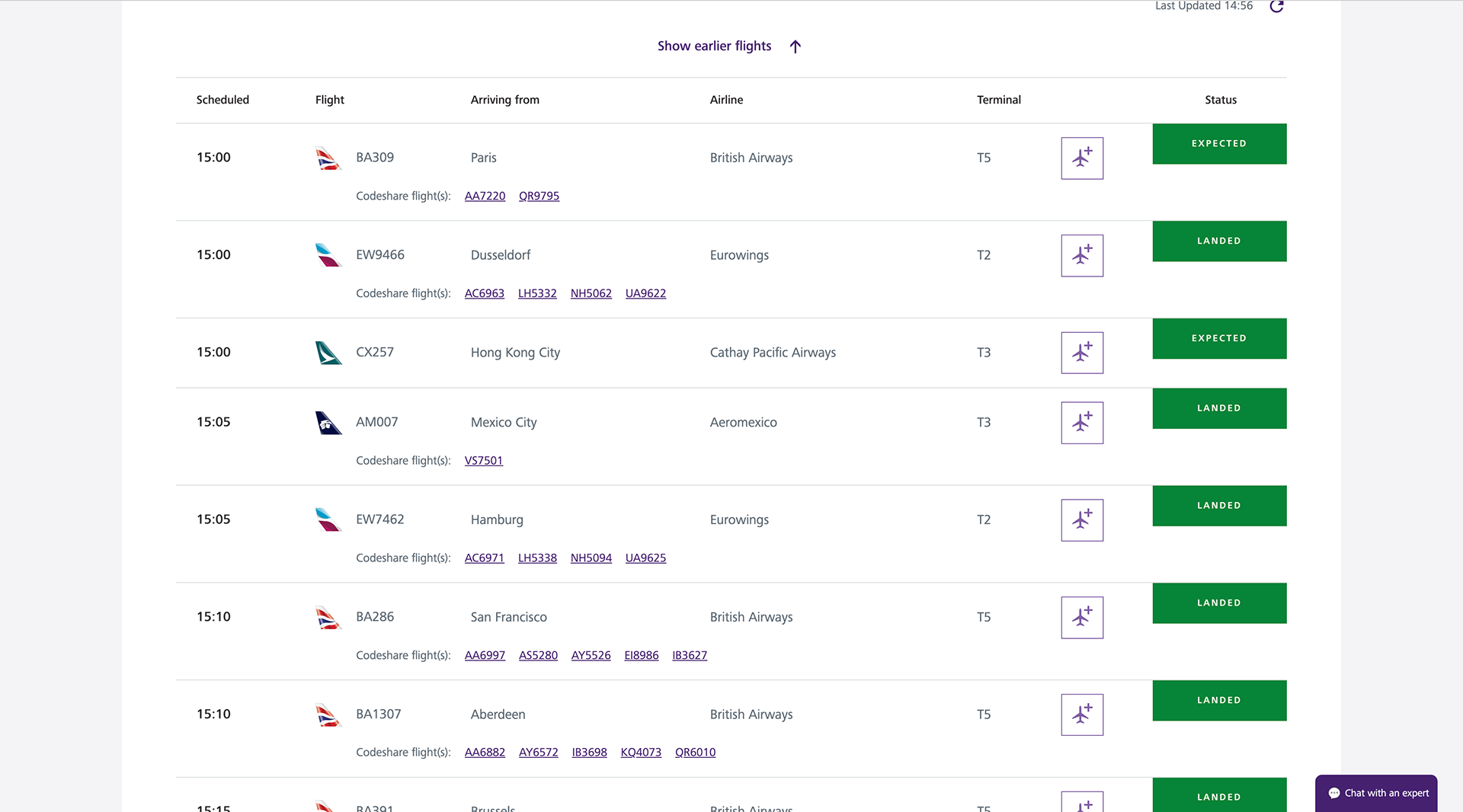
The research portion of this project started with studying airports. I researched the Heathrow International airport for their typographic and information decisions for inspiration. The Heathrow international Airport uses the Frutiger Next Paneuropean typeface, which is a highly accessible typeface and has widespread use. The information sections also included a strong grid system.
Phase 2: Conceptual Layouts
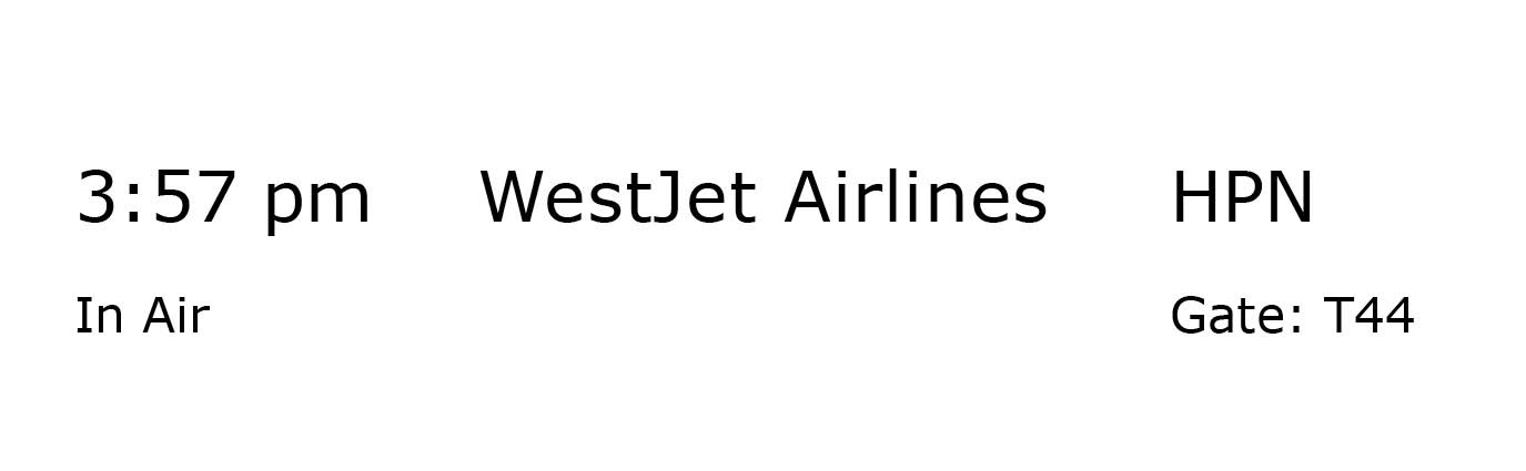
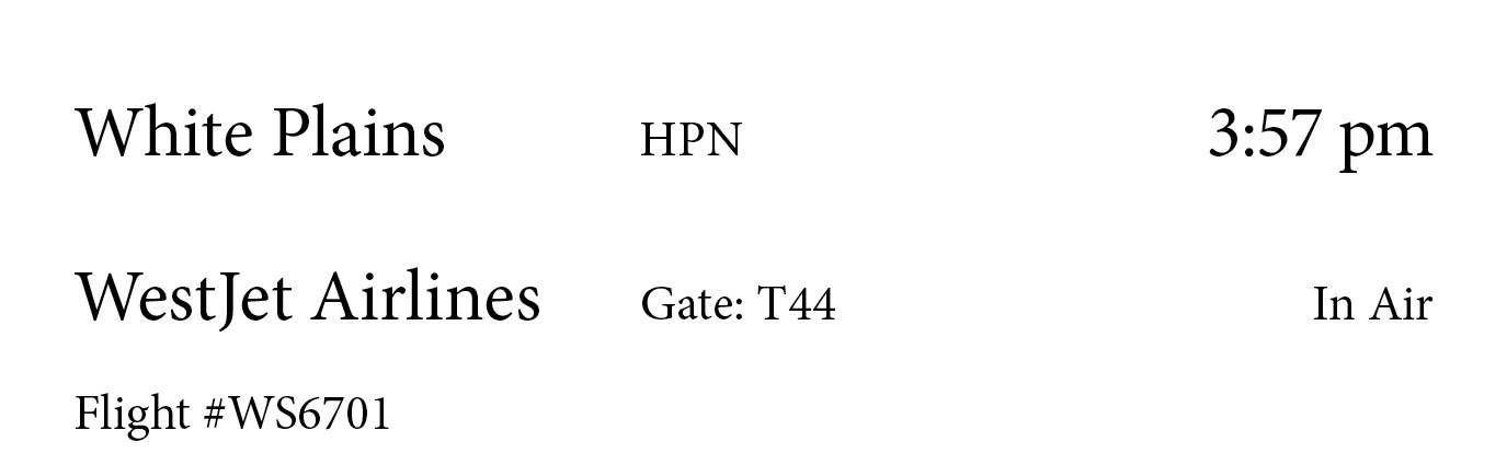
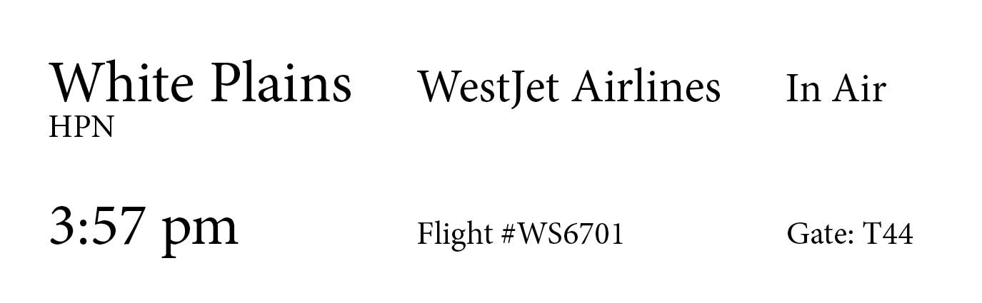
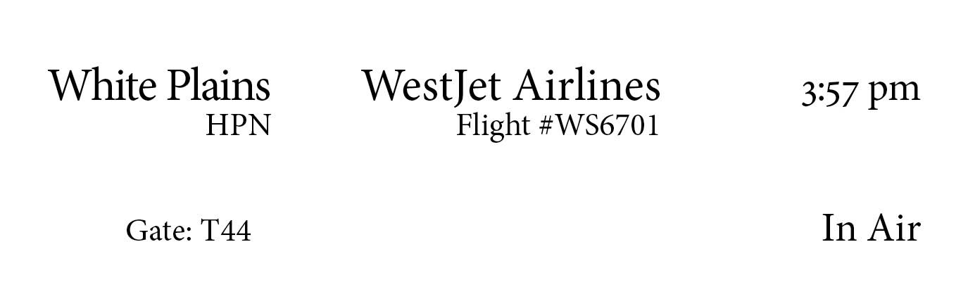
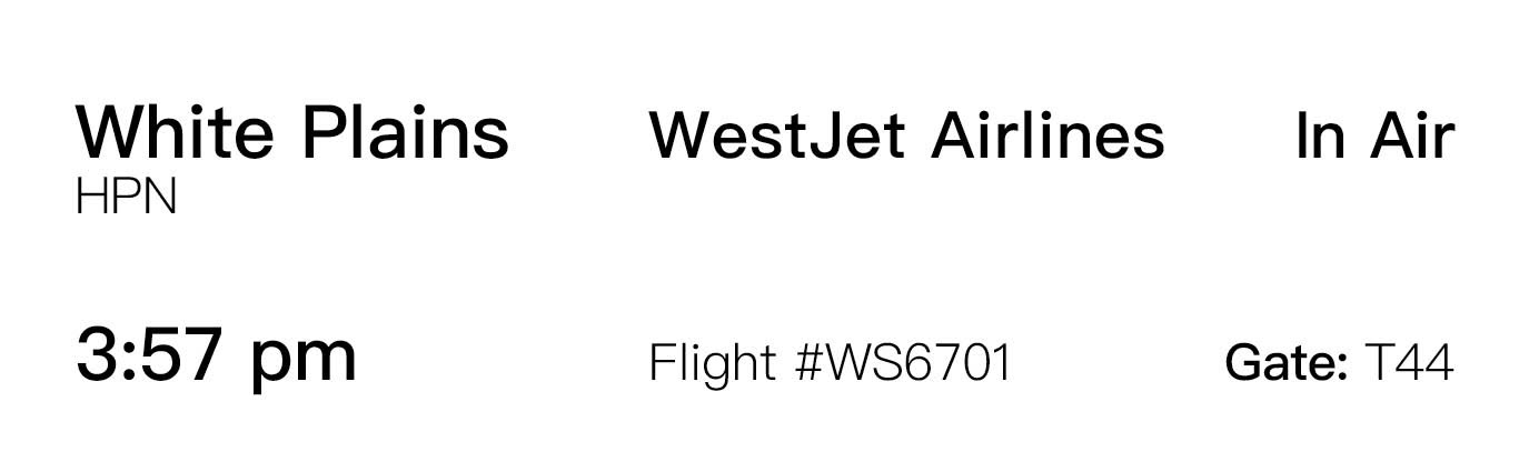
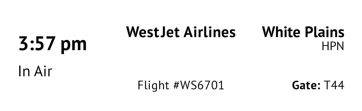
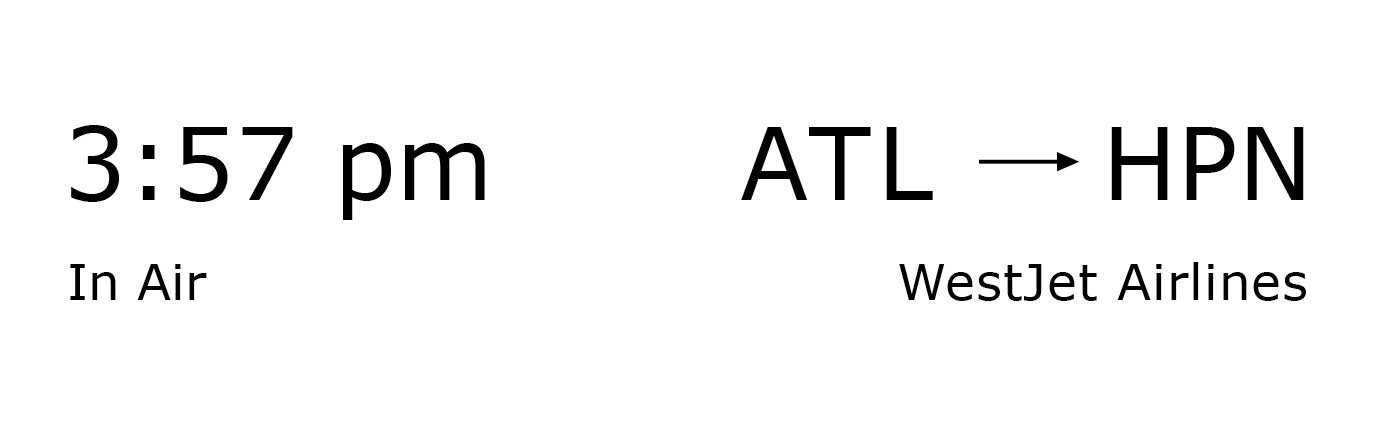
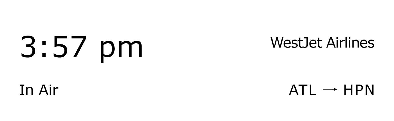
The next step in the process was to test different layouts to pinpoint how the information would flow together best. The biggest challenge was to make everything fit without being too busy.
Phase 3: App Layout
Once the information had a general layout, the next focus was on how to craft the app. It needed to work in a way that was convenient to the user.
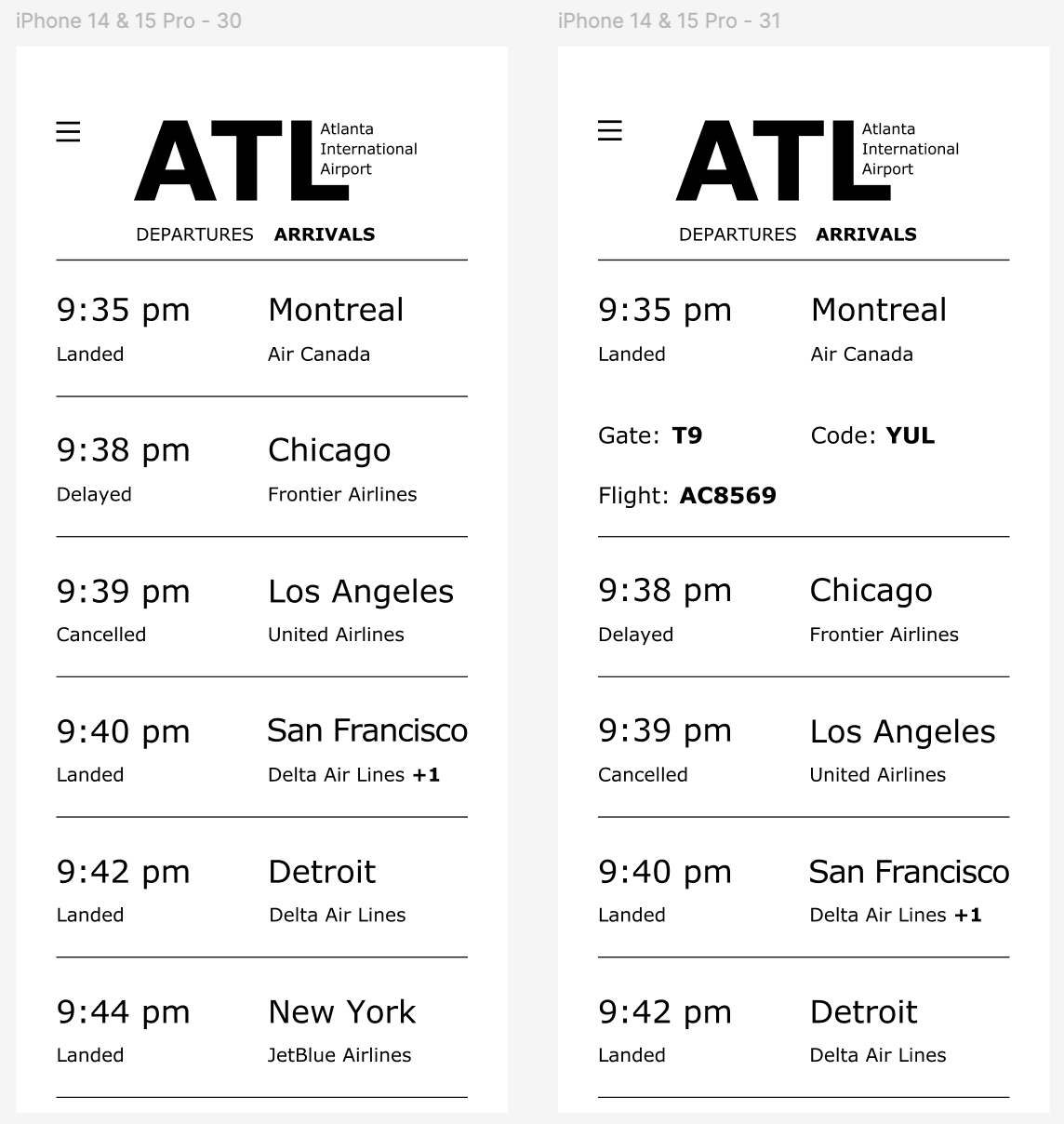
Phase 4: Final Composition
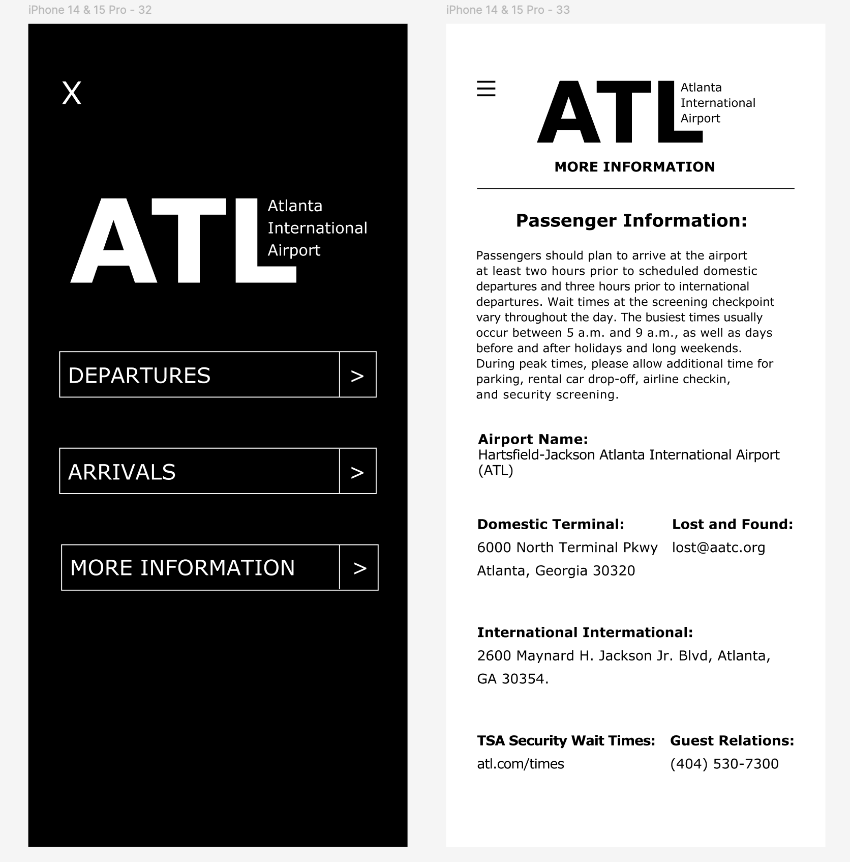
The final composition had a focus on colors with high contrast that were also visually pleasing on the eye.