Project Scope
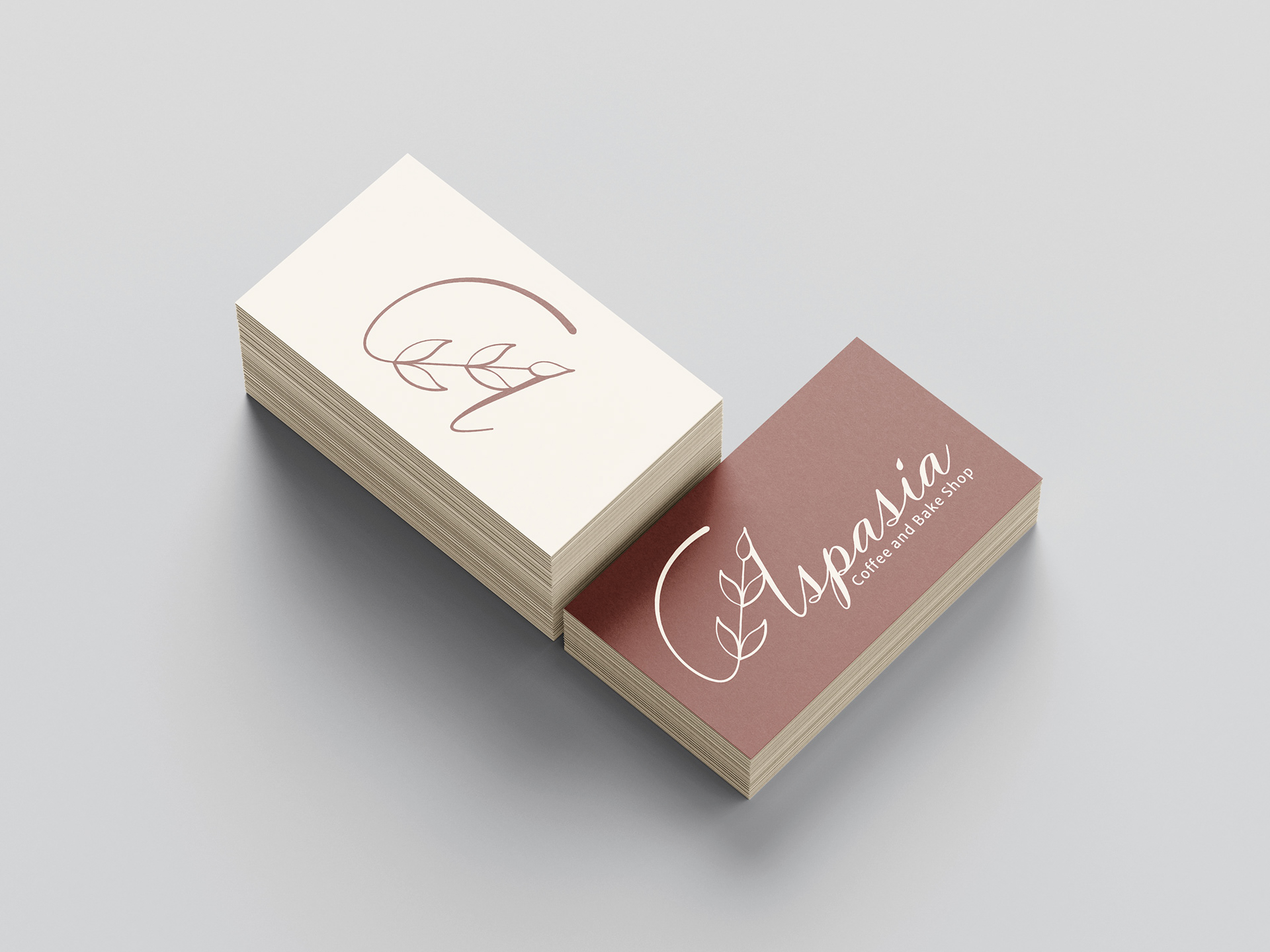
This project was focused on a brand refresh for a local coffee and bake
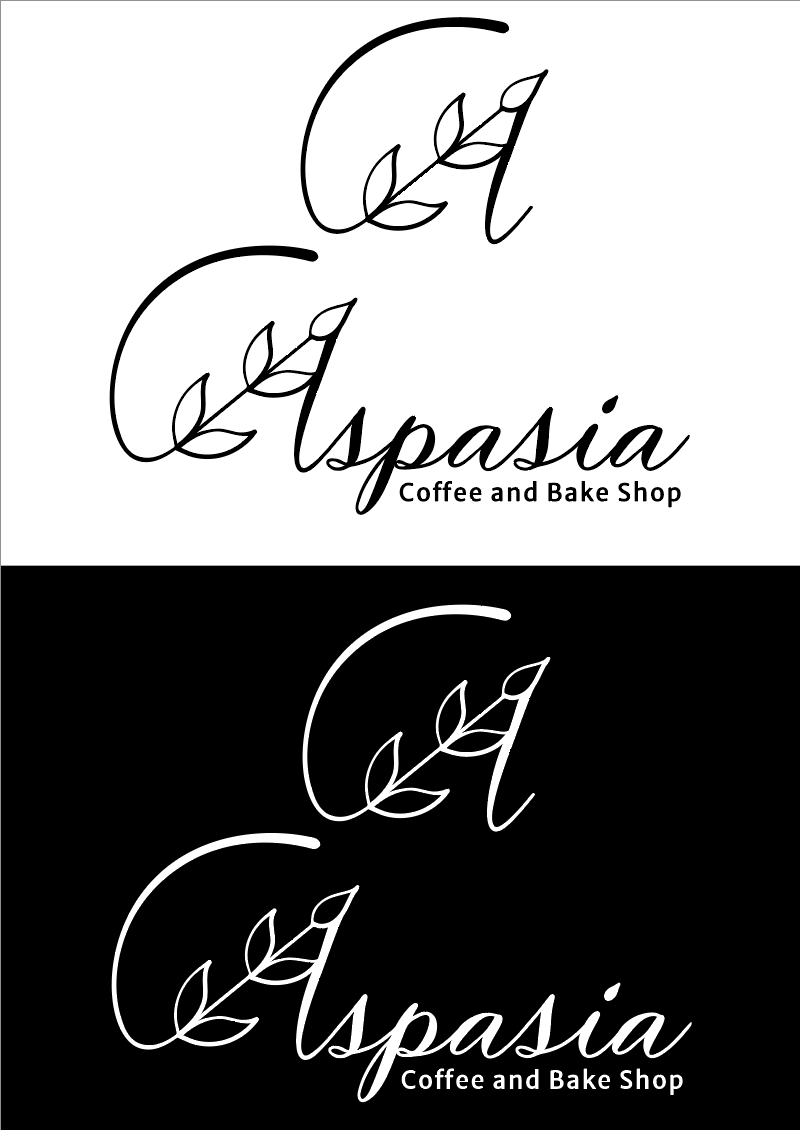
shop called Aspasia. The original logo seemed to convey a spa more than a coffee shop. This project was one that I was tasked with in highschool and
we had to redesign a logo for any local small business. After completing my first year as a DAAP student, I reviewed my old logo and decided to redesign it once more. The company's original logo (top) along with my old logo (bottom) can
be seen on the right.
shop called Aspasia. The original logo seemed to convey a spa more than a coffee shop. This project was one that I was tasked with in highschool and
we had to redesign a logo for any local small business. After completing my first year as a DAAP student, I reviewed my old logo and decided to redesign it once more. The company's original logo (top) along with my old logo (bottom) can
be seen on the right.

Phase 1: Initial Sketches
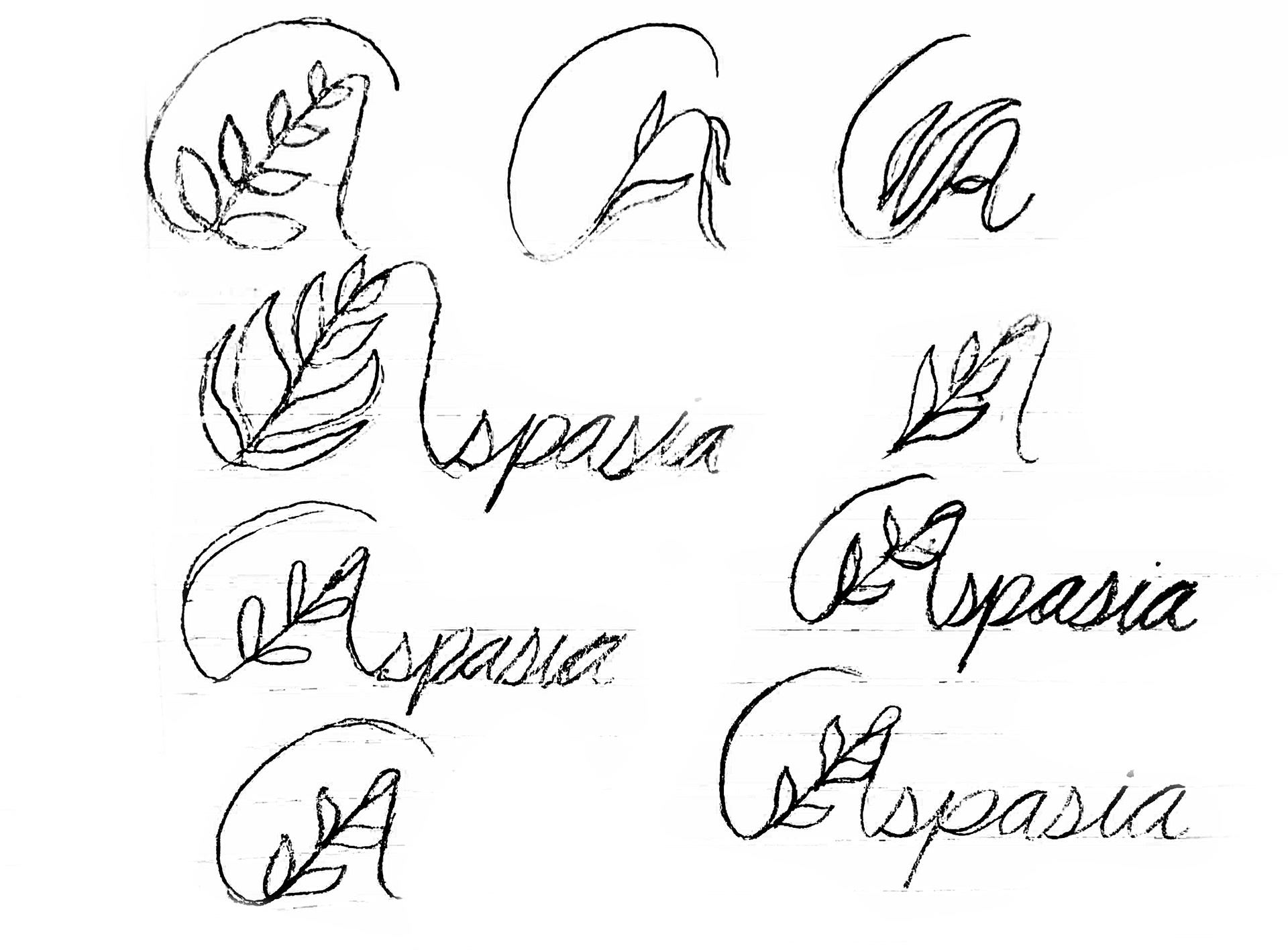
For my concept, I wanted to stick with the same idea of having the A be apart of latte art surrounded by a cup, however i wanted it to be more implied and less literal. The old logo also felt too complicated and had nothing to be a just a logo instead of a wordmark attached. The initial sketches show the concept with simplicity.
Phase 2: Digital Translations
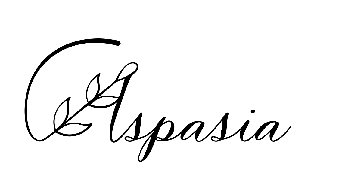
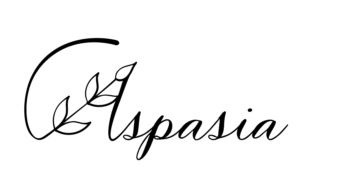
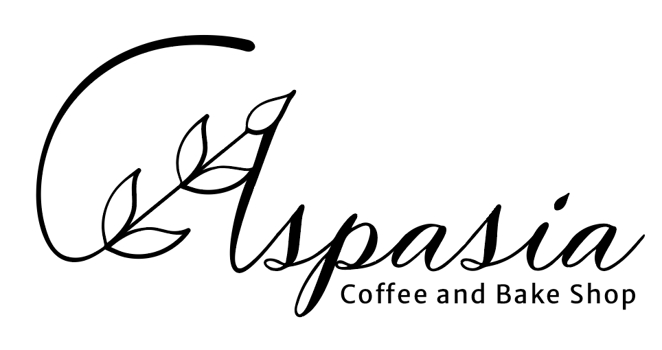
Once I got my general sketch and idea down, I made it digital. Most of the digital process went smoothly with only a few tweaks here and there.
Phase 3: Color Scheme
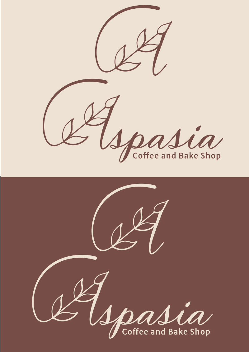
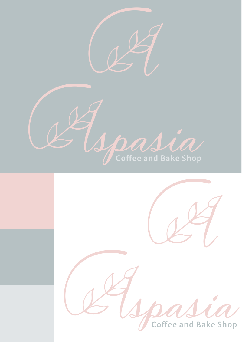
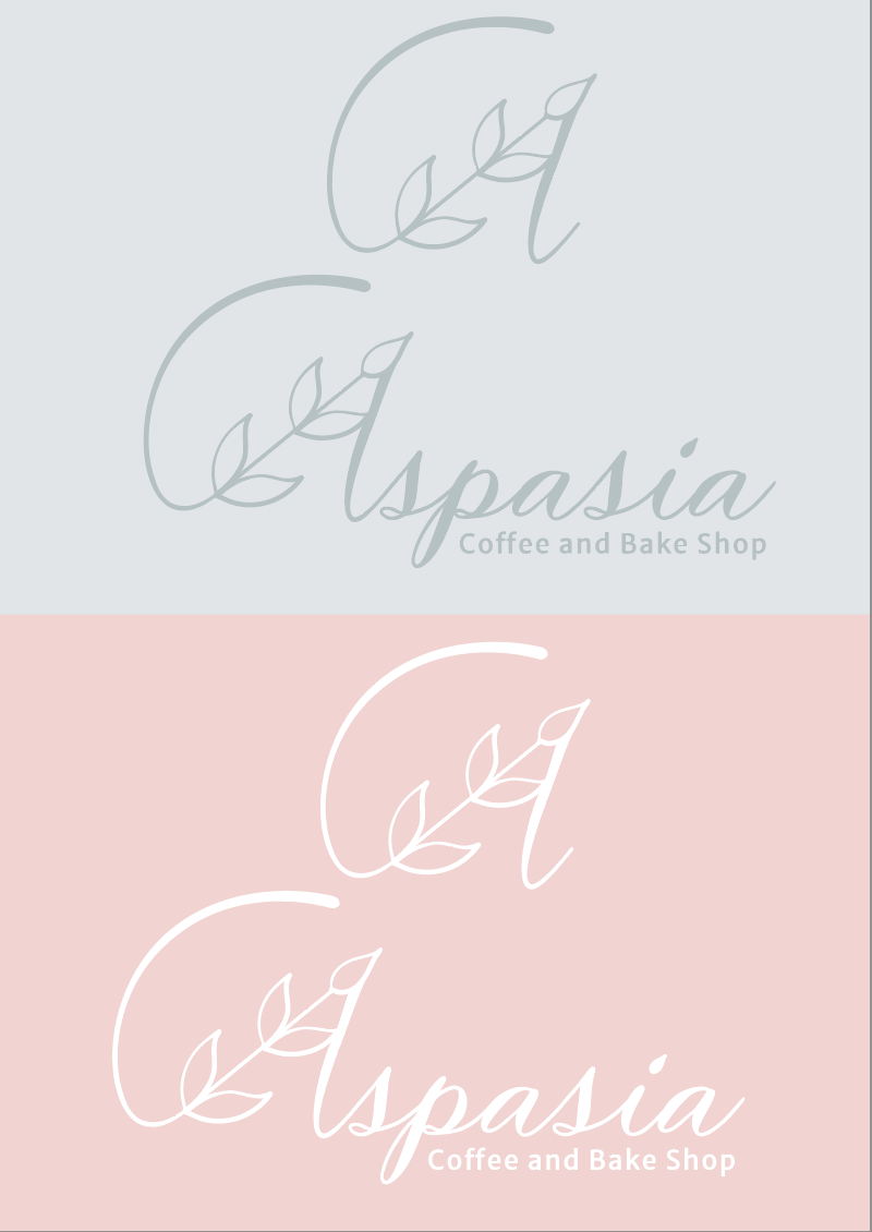
Originally, I wanted to stay true to the color scheme that the business
had already established. I quickly learned that the established color scheme led to some legibility issues and failed to communicate coffee shop. In
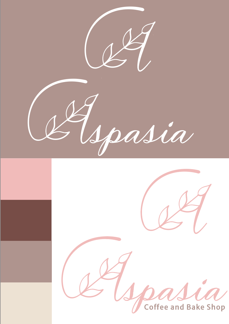
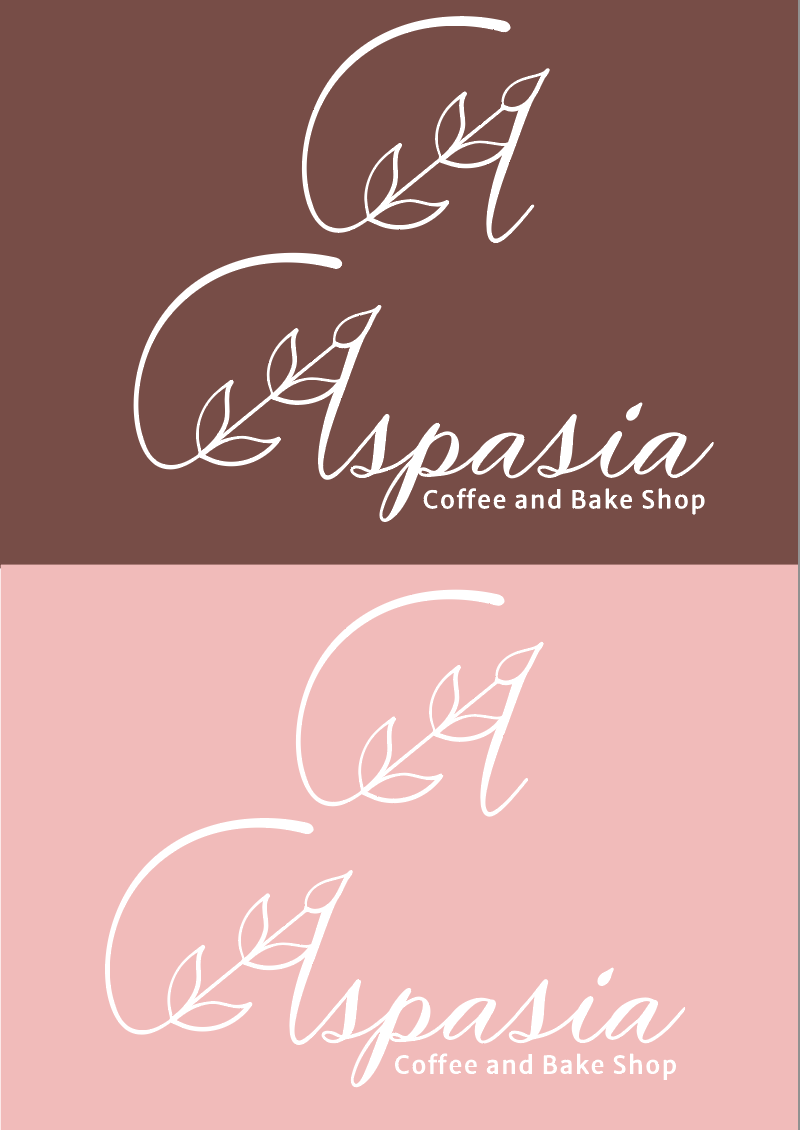
order to combat this issue, I switched the color palate to more browns and neutral tones while keeping their signature pink (but slightly darker) as
an accent color.
had already established. I quickly learned that the established color scheme led to some legibility issues and failed to communicate coffee shop. In
order to combat this issue, I switched the color palate to more browns and neutral tones while keeping their signature pink (but slightly darker) as
an accent color.
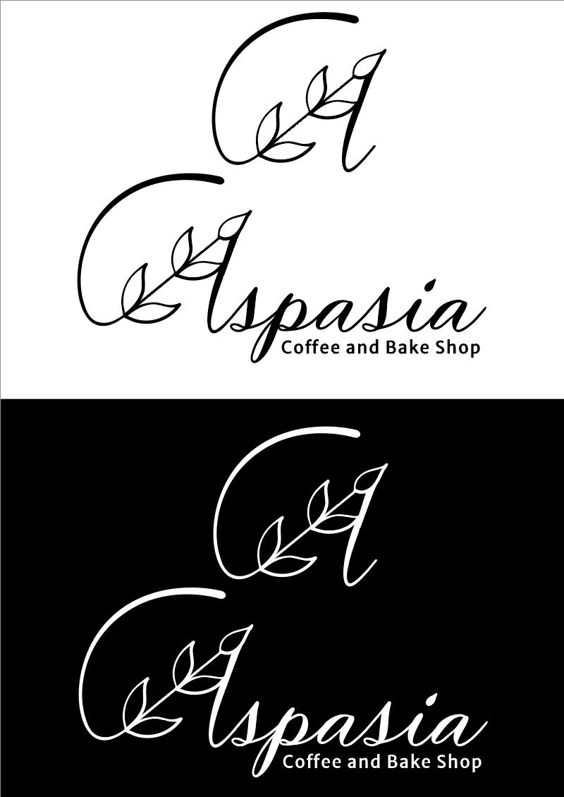
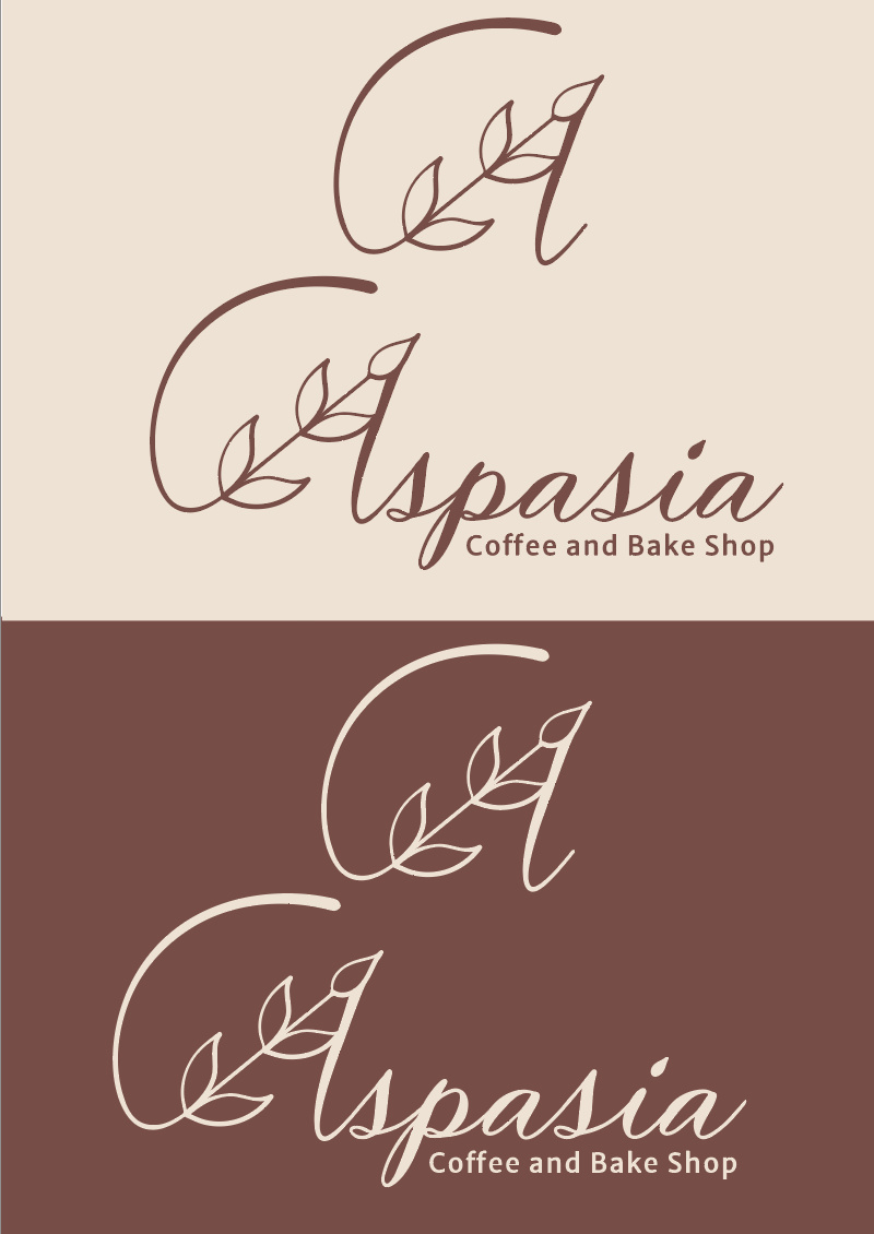
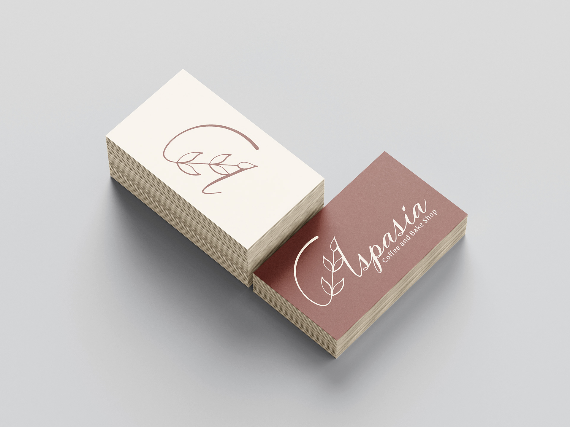
Phase 4: Final Composition